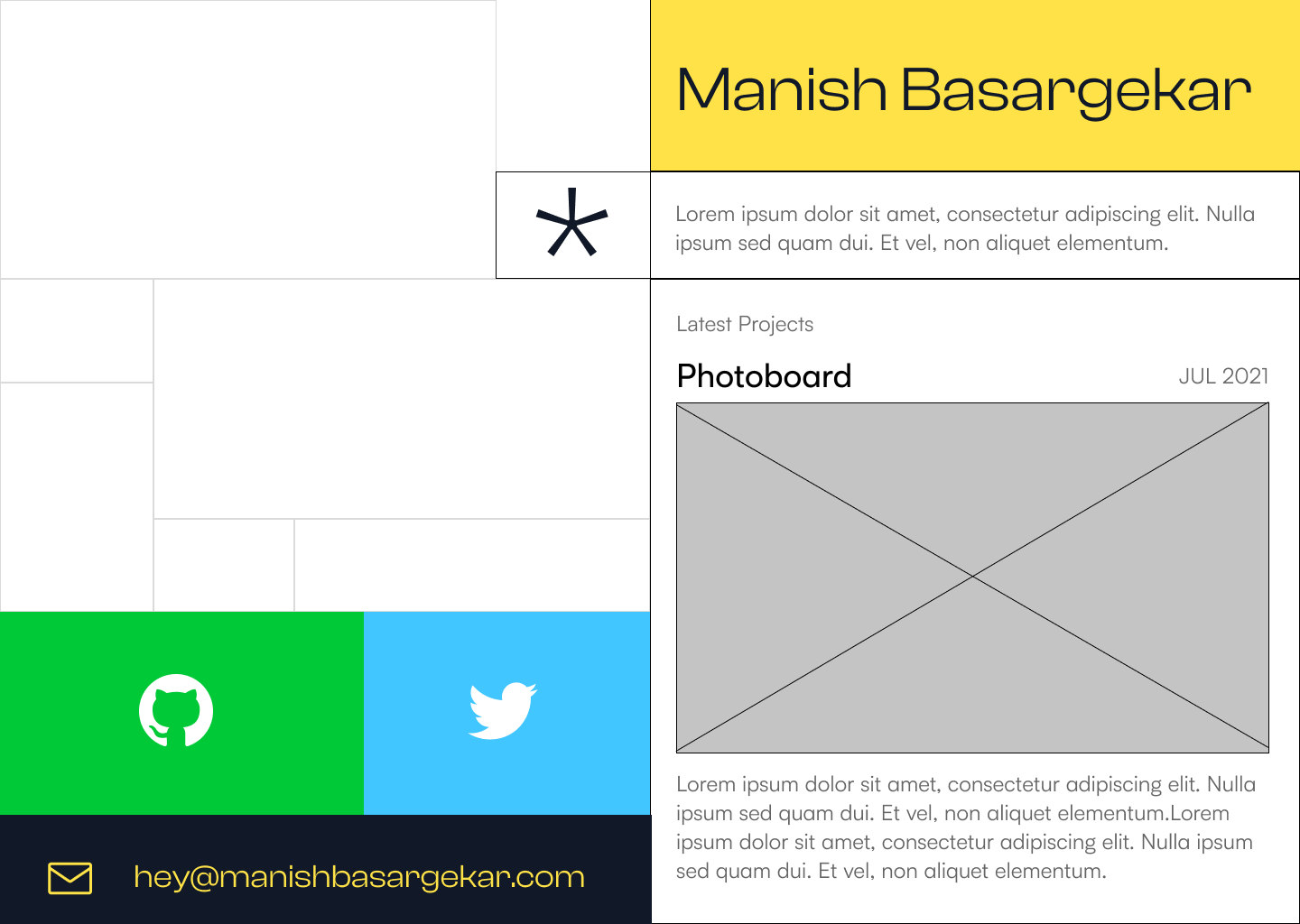
Design Of This Website
I love building sites, part of the love is mixing and matching different things, unifying them. When I was a kid, I did this with posters I built. Different fonts, fancy layouts, complementing colors all are part of the joy.
This was the initial version of my site, nothing much, just a background stolen from one of the demos of pts.js. and business card type of info in the bottom left corner. The result was fairly charming.
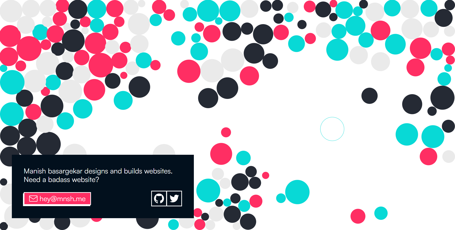
V1 of my personal site. You can visit it here
Interesting facts about v1:
- Every time you visit the site(or refresh the page), the color palette of the balls is different, so every visitor sees a different theme :)
- The animated favicon: Only works on Firefox, tho! Go check it out
- The background balls are straight out of ptsjs demo, I modified it a little according to my taste
- The background glitches if you leave the site open in the background for a while(Oops!).
- It was built with vanilla CSS, HTML, and JS.
The Current version
What you are seeing now is a result of a fairly large number of tiny experiments. The v1 site was good, but I needed to show my work and writing. Of course, I could have just extended the v1. But I needed a proper layout, and I didn't know how to start with the animated background balls, so I ditched it altogether and started from scratch.
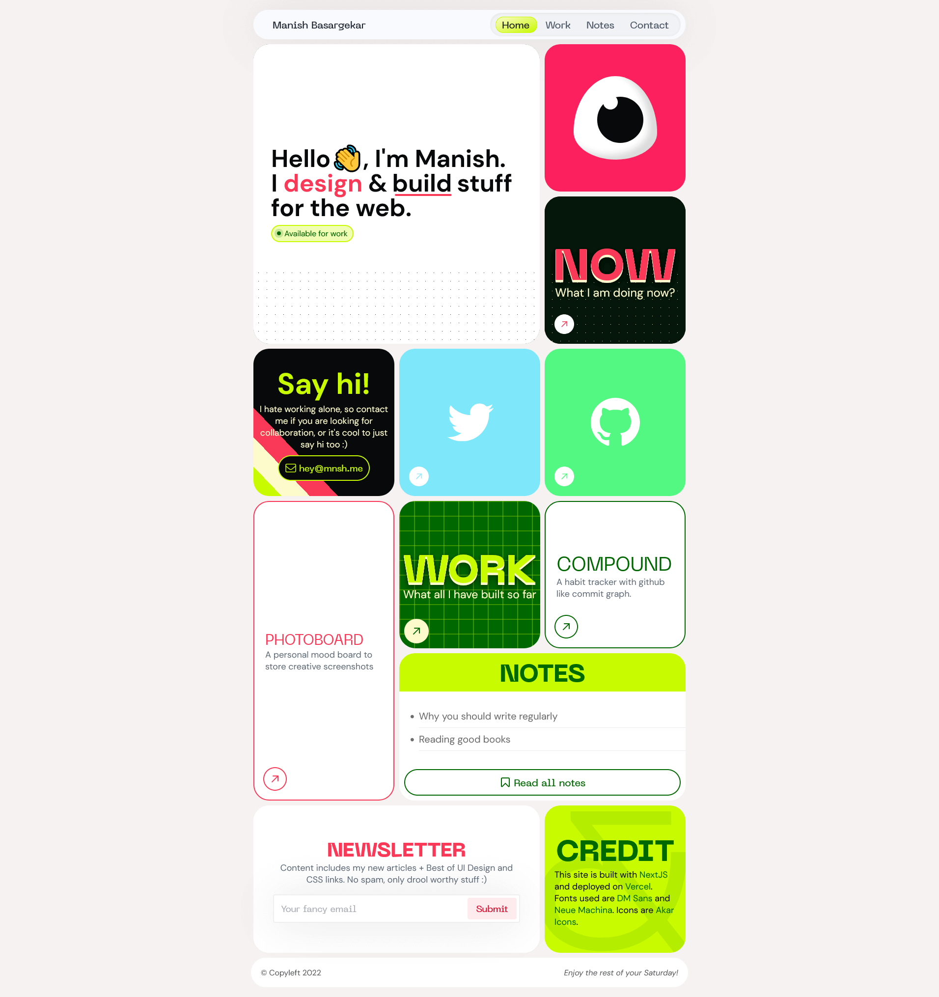
Amateur tip: build version 0.1 of your desired design as quickly as possible, just make it work, beautify it later.
Design process
Most of my projects starts with inspiration hunting, Important thing is you have to know what you are in hunt for. You have to at least know the theme you are going after. For example, you are building sites which sells baby cribs, your theme would be friendly, welcoming, cute, your site should be relatable to the parents, who are browsing your site.
SO you will start with, what makes a site friendly/welcoming/cute/calm. Identify those attributes in design of websites which sells baby cribs. Border-radius, choice of fonts, background colors, type of pictures. These attributes may be subtle, but provides important cues which makes the site relatable to the visitors. Identifying those attributes takes practice.
Since this was my personal site, my theme was quirky, fun, distinctive and
- Something different, I didn't want my site to be a cookie cutter site. It had to be unique and something which showed what kind of builder I am.
- Fancy layout : CSS is capable of crazy things.
- I wanted to build it like a personal app: something which is fully dedicated to me and my work.
This site was going to be seen by all kinds of people. My friends, my crush?, strangers, potential recruiters/collaborators & other designers. So I had to choose the words and design language accordingly. Not too corporate or friendly, but distinctive and in a way, everyone can understand what I am up to. After all, This site was me in a digital form.
Let the inspiration hunt begin!
Here are some of my fav layout inspiration sites:
- Godly.website
- Siteinspire
- Httpster.net
- Onepagelove
- Designpiration
And Some designers I follow-on Twitter
During the layout hunt. I stumbled upon Spotify’s loud and clear website.
This was appealing to me for two reasons:
When I was a kid, I built a poster with the Similar layout .
I like how every block has its own style, but is relatable to every other block in the layout.
I immediately fell in love, I experimented with it for my site. But I couldn't build convincing design due to lack of content. Here are some of the layouts I came up with:
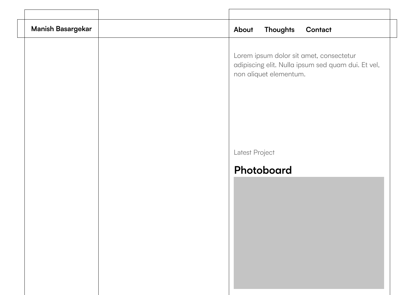
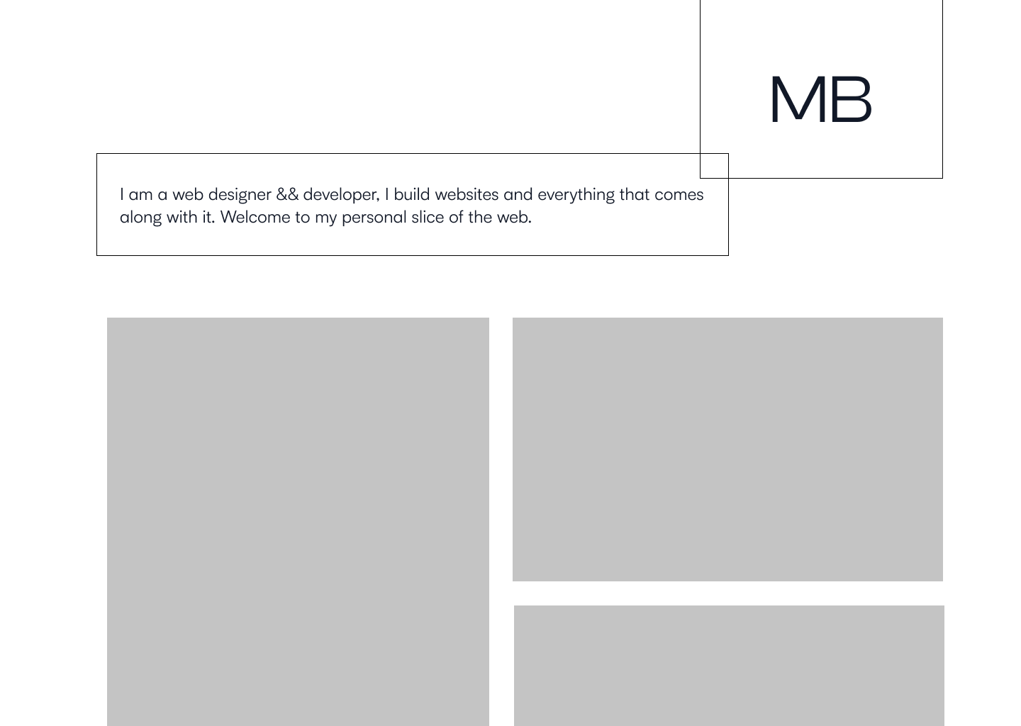
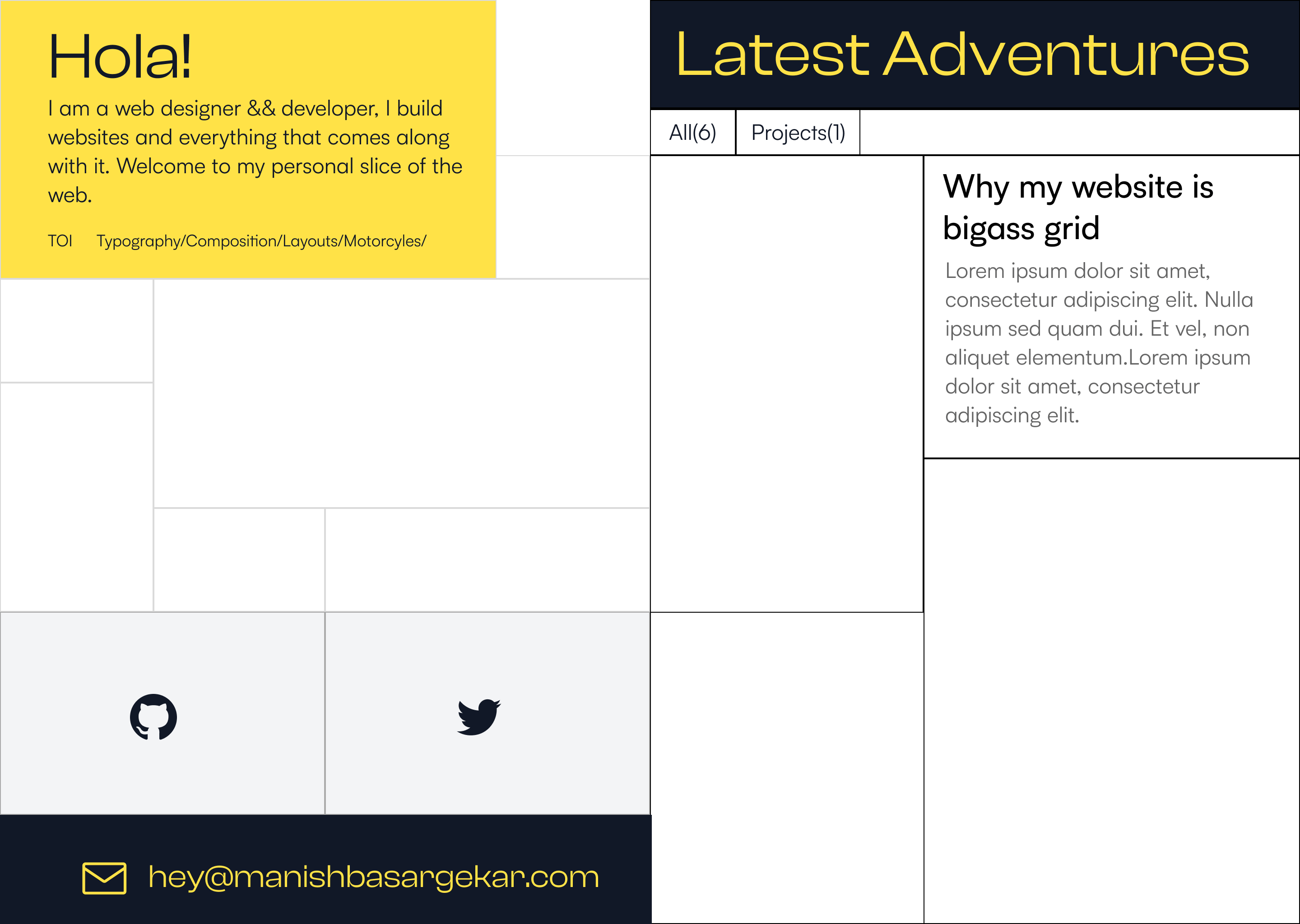
All layout may look childish, but this was the best at the time I could come up with.
Back to the drawing board
You can experiment with hundreds of different layouts, colors, fonts and still not like it, which is why I love to design. I always feel like a mad scientist building an exquisite compound with carefully studying all its constituents and mixing and matching different quantities. I don't know how other people design, but I like to design and fail until I come up with the design I drool over.
Plus I don't have to rely on anyone to make my designs a reality, I can code it like in few hours to see if it's viable(responsive n all).
Now that I partially had figured out the layout I was going after. Inspiration hunting was easy. Search for blocks of layout, where each block has its own theme but is relatable to every block in the grid.
During this time I stumbled upon mad.ac, nev flynn’s portfolio. I liked the nev flynn’s site the most. Stole the layout idea and kept working the individual blocks.
Good artists borrow, great artists steal.
I thought the layout was made with CSS grid, but it turned out that all the heavy lifting was done by react-grid-layout. Drag and drop and those shifting of blocks weren't necessary, but it definitely added something to the whole site’s experiment, so I kept it as is.
I decided to go with max-width:900px for the whole layout container. Now that I had the base layout ready, It was time to work on individual blocks. The dynamic shifting of blocks could have been done by CSS, but it was more pain than pleasure, so I decided to go with react-grid-layout. So props to react-grid-layout (pun intended).
It was this time I felt so grateful to be a dev. I don't think I can build anything near this complex and worthwhile all alone. Hundreds of thousands of open source contributors have made it possible via open source libraries and frameworks.
Imagine building a full stack MERN app in vanilla JS. It could be a learning experience, but your development experience would be so poor that you won't dare to do it again.
With the base block layout done, Now I had to figure out the individual blocks. Initially I decided to have
- Work
- Intro block
- Now page
- Newsletter
- Notes
- 2 or 3 projects
- Contact details(email, GitHub, twitter)
- A digital garden(where I dump all my fav links, like a personal wiki): I removed it because I didn’t want to maintain all links manually like layout and all.
For each of the external page, I made a block for it.
Font choice
At this point I already had decided to go with Neue Machina, A more edgy and machine-y font to complement the blocks with heavy border radius and a more subtle sans-serif which is DM sans, I did consider the other sans serif like inter, Switzer, Satoshi but DM sans looked like it had more character(no pun intended).
If you have no idea on what fonts to use, or which to pair. Look up what fonts your favorite/competitor site uses and how they are using it. You don't have to be a typography nerd to figure out the perfect pair of fonts. Heck even a pair of fonts is not mandatory, see how Vercel uses Inter everywhere. I use fonts mostly from Fontshare.com and google fonts. Sort by popular.
Colors
Colors of the site are the main highlight which unites each block even though they address different things.
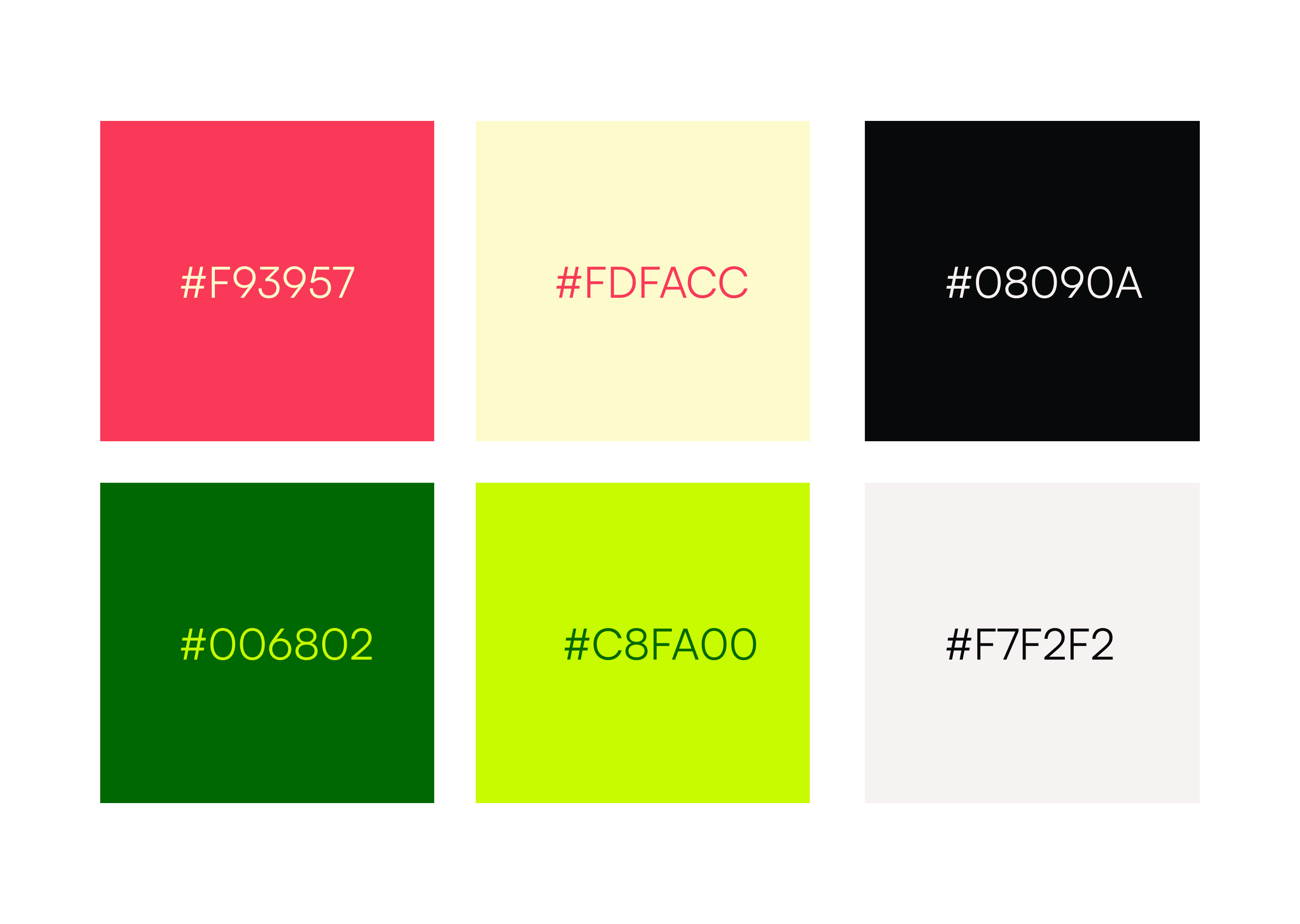
I decided to go with a crimson-ish(#f93957) as a main color now I had to find an accent and different shades of color to keep consistency. Not only that, but I needed 2 pairs of color which matched with each other well. If I had just used 2 colors, all blocks would have looked the same. I wanted them different enough to stand on their own but also to relate to each other. If you have no idea of colors, TailwindCSS does have a nice palette to start with.
How do you know you have chosen and used your palette perfectly? You train your eye to identify elegant color patterns and usage. By feeding over hundreds of well-designed things which are rich in color and other design elements(like nature, other graphics, websites, magazines, advertisements, expensive clothes, architecture etc.) you train your brain to identify desirable patterns. Browsing just the color palettes won't do anything, as real use of color is tricky. Color palette can help you choose colors once you have a rough idea of the look you are going after.
Another tool I would recommend is Huemint. It definitely helped me to come up with contrast-y colors, now it was just time to experiment until it looked perfect to me(mad scientist at his experiments again!).
Here are the colors I ended up using:
#f93957, #FDFACC, #08090A
#006802,#C8FA00, #F7F2F2
Tech stack
Tech stack was obvious to me, Since I knew react, NextJS was the best option overall. Your best stack is what you are comfortable with most. I already made some sites with Next, and I liked overall experience.
I don't like using CSS libraries, cause all the website look same using it, the downside of not using it is you have to build everything from scratch.
Everything on my site is vanilla CSS. I am using SCSS with CSS modules. Considering the time it takes to do everything from scratch every time, I am thinking of trying and testing some CSS frameworks or make my own framework, I have avoided them for a long time now 🥲. These are the frameworks I am looking forward to try: Bulma CSS, chakra UI, tailwind CSS
I am a fan of all things CSS, so the backgrounds of many blocks(like the graph and dotted grid) are made with pure CSS, Go inspect it!. Even the stripe background at the email block is made with CSS gradients. You don't know how much CSS is capable of until you experiment.
The blog is simple markdown files compiled into HTML by remark. Considering it doesn't give much freedom in making the article more interactive and rich, I am thinking to upgrading it to MDX, which is more versatile.
Finding inspiration
I use tabliss as my new tab, so every time I open a new tab, it shows me a beautiful Unsplash image, It's one of many ways I feed on quality design.
Someone asked me on reddit(comment link):

Here is my take: If you look closely enough, great design is everywhere. You have to feed yourself quality stuff a lot to be able to identify and create drool-worthy design. So hangout with other people(online and offline) which you think make and share quality stuff, steal their designs, make your own remixes. You won't come up with a design you like, the first time you try it. Don't fuss. Keep experimenting, gather feedback and more importantly don't forget to drink water.
TODOS
I still have a long way to go. These are some features and issues I would address
- Dark mode
A global Navbar: Current Navbar is not global, The one on the homepage filters the blocks whereas the Navbar on the current page, navigates to other external pages. This is not optimal. It definitely confuses the visitor. Homepage Navbar needs to be global, So I have to figure out to apply the block filters, some other way. Global navbar addedUpgrading from Markdown to MDX: I would love to make this blog interactive, current setup doesn't give much freedom :(. Upgraded to MDX!- domain name?: Do you think I should switch to .com? I think so. My name is so huge, I am not sure if I should take it.
Add screenshots of the projects on individual projects.Done!- Add comments and reactions to blog.
Final thoughts
What you are seeing now is the result of hundreds of tiny experiments to achieve a different looking layout. Not everything might be original, But I like to build things on top of other quality stuff out there. Some people might label this is website as gimmicky, but I had a ton of fun building it. I mean, if all the websites looked the same and had predictable design, there would be no fun, neither for the visitor nor the person building it.
Don't forget to have fun building stuff!
Thanks for reading.
