1 year of having a personal site

Today marks the one-year anniversary of building and having my personal site. In this post, I share my thoughts and ideas for those planning to create their own site or blog. I also list the mistakes I made during the building process and share my plans for the future of the site.
I have updated my site many times and it is not what I started out with, but I am proud of the progress I have made. It is fun when people can interact with the website, it feels like having a digital self.
First, let's take a look at some numbers.
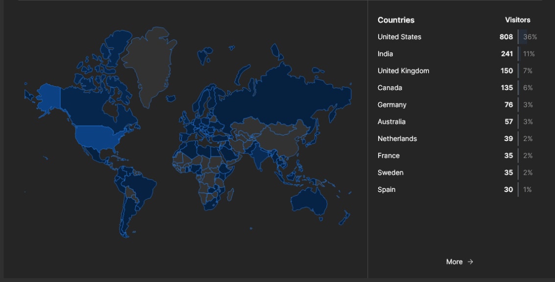
Approximately 2,000 people worldwide viewed my website. Although this number may seem insignificant, I noticed a high bounce rate, indicating that many visitors are leaving quickly.
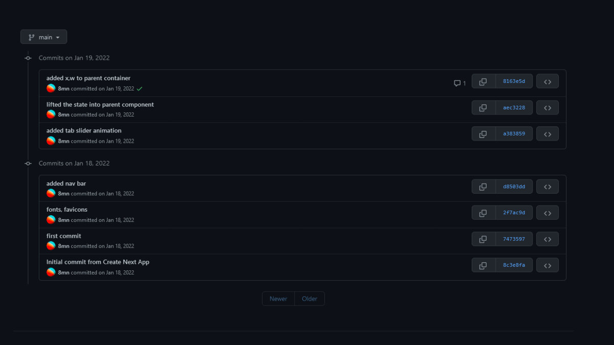
My website is apparently the longest project that I have worked on.

- With 279 commits and 21 branches, it's clear that I experimented a lot during the building process. Despite this, I still have much to learn about design systems, planning, and maintaining a site.
Design choices
A good starting point for someone building their personal site is to build with what you have
I decided to go for a complex, fancy website design. This made it difficult for me to update the content (Homepage specifically) without disrupting the initial design. At the time, I did not have much content as I was just starting out, so I focused on visuals. A good starting point for someone building their personal site is to build with what you have
I followed the principle of keeping it simple for the first version of my website, with only my name and email included. However, I failed to do so with the current version. I wanted to include everything that could be included on a personal site
I regret optimizing the site for visuals over content. I am embarrassed by the design I created a year ago, which I believe is a good thing, as it shows growth and progress.
In design, form follows function, so I should have focused on optimizing for content first. A better approach would have been to create a simple site with a simple design and then gradually added complexity as I added more content.
Having a complex site starting out can backfire when you are still figuring things out. With my current site, it's difficult to update the homepage because different layout shifts occur when clicked. I can't update the layout regularly, and if I do, I have to reconfigure the block's position in all different layout configurations, which is a pain with react-grid-layout. In my case A boxy layout can also be achieved with simple CSS without react-grid-layout.
I guess I was too attached to the layout shift effect, which caused me to overlook the difficulties of updating and maintaining the site.
I realized that having a layout shifting on click isn't helpful to anyone. It was just a gimmick and in fact, it is frustrating for the user if their scroll position is not at the top of the page. It was also terrible for me to manage and doesn't work at all on mobile devices.
react-grid-layout is meant for building draggable and resizable dashboards. I used it for the layout shift effect. I could have used a simple CSS grid instead.
I also realized that there is a performance overhead for mobile devices due to not properly optimizing react-grid-layout. In fact, react-grid-layout is not needed on mobile at all. Overall, it was a bad decision to prioritize fancy design over usability. A little bit of fancy design is fine, but to make the whole design goal fancy without considering usability is a terrible trait for someone who wants to become a UI designer. I see it all the time on Dribbble and now understand why some people make this choice
I have learned some important lessons here, such as the importance of keeping things simple and focusing on usability over fancy design. I also learned the importance of optimizing for mobile performance and being mindful of the limitations of certain tools. Overall, I believe these lessons will help me in my future design projects.
The Domain name
Having a short URL, www.mnsh.me, was easy to share(& type) but hard to pronounce. For example, when I met someone and wanted to show them my site, I would tell them mnshDOTme and they often wouldn't understand. So I would have to manually type in the URL. This failed the "radio test" as it was difficult to communicate verbally. I'm still not sure what domain name to choose, as my name is quite long.
So short and dot com right? but such names are only for VC funded startups or domain squatters. I have seen people using modified app name as domain name with prefixes or suffixes like get,app etc. But I am not sure about my name though. Maybe a short redirect to actual domain name would be a good idea.
Many people are still unaware of the different domain extensions available beyond the traditional .com. Even some of my computer science classmates were not familiar with other options.
How to showcase projects?
I still don't know, how to showcase all the things I built properly. I wanted my site to be somewhere between a personal blog and professional portfolio.
The problem is that some of my projects are from hackathons and others are just half-assed experiments. I couldn't figure out how to showcase them properly. I thought that sorting by time would be useful to solve this issue but I now have realized that it's not.
Additionally, different projects have different links, and I also wanted to showcase my UI experiments(like Codepen). Redesigning this page will be interesting.
I despise the current page for projects on my website, it is disorganized and messy. I am planning to redesign it and make it more organized.
I am going to research well to build a proper showcase for my work.
Dont mess with fundamental design elements
I learned that it's important not to experiment with fundamental design elements. The first navbar I designed for the website was not a navbar at all, it was just buttons that were used to shift the layout. This backfired when designing secondary and tertiary web pages, as they needed proper navigation. I solved the nav issue on mobile by building an overlay, and then on the desktop site with two navbars, one for global pages and secondary one as a breadcrumb.
Here is what the initial "navbar" looked like

What now?
I am currently reworking the homepage of my site, ditching react-grid-layout and 900px max-width, and focusing on performance optimization. I am also reworking my project page and considering a new domain name.
Here's a summary of the new updates I am making to my site:
- Converting to typescript
- Implementing a dark mode
- Redesigning the /project page
- Updating the homepage and ditching
react-grid-layoutandmax-width of 900px - Adding more visuals and interactive elements to the blog
- Performance optimizations for mobile devices
Instead of starting from scratch, I am reusing the same codebase and just reworking the design and adding new features. I want to learn how to build and maintain an existing site. Also maintaing a proper design system is a another monster I have to tackle.
MNSH 3.0 :)

Follow me on twitter for updates!